jcalcutt.github.io __main__
Investigating My Apple Activity Data With Python
Hidden away in a rarely opened folder on my IPhone is the ‘health’ app. I’ve known for a little while that it has an activity tracking capability (essentially a pedometer), but it’s not something I’ve thought twice about until fairly recently. I’ve unwittingly been collecting data about my activity for well over the last two years …Surely, there was bound to be some more interesting stuff lurking in that data - other than the daily step counts generated by the app. So, one rainy weekend or two ago, as a bit of a side project, I set myself a challenge to try and make sense of this data.
First steps
After a brief internet search I soon found out that all this raw data could be exported from the app as an XML file. The XML contains a fair bit of ‘junk’, so converting to a nice, clean CSV - in order to load into a pandas dataframe - was necessary. Since I was time constrained, I found this pre-made applehealthdata.py script which does all the laborious work in a few seconds. NICE!
Running this in the same location as the health data export.xml file:
$ python healthdata.py export.xml
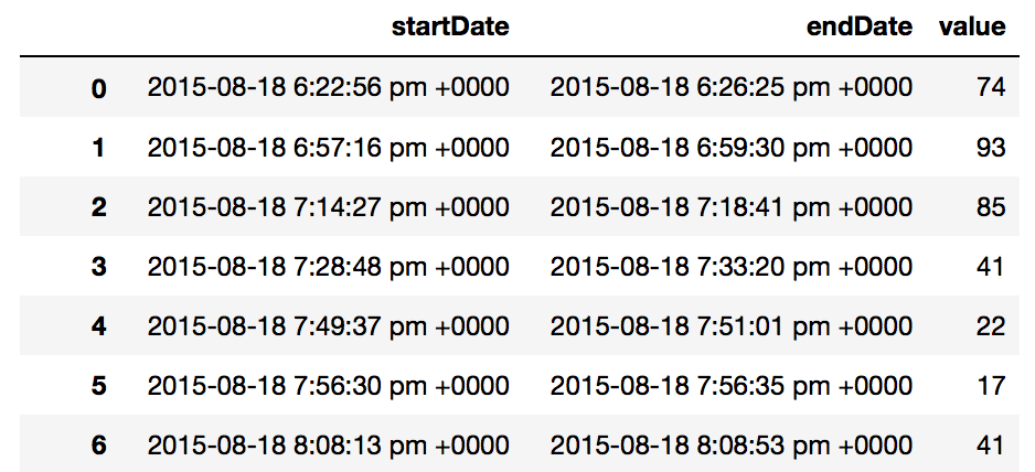
This raw data is collected as ‘startDate’ and ‘endDate’ datetime columns, and the number of steps taken between these times, a ‘value’ column.
Since my phone is in my pocket both; shortly before I go to bed and not too long after I get up in the morning, I figured that I could work out a ‘sleep’ duration. This would be based on the last value from the previous day and the first value from the current day. Of course, this would not be completely precise but would at least give a fair indication, at least as a precursor.
So, next I wrote some code that would find the last value for day i and the first value for day i+1 and subtract the two datetime values, giving a time delta object - a time in hours which represented a rough indication of my sleep time.
begin = new.date[0]  # first date in the data as reference point
i=0
sleep = DataFrame([])
total_days = new.groupby('date')['date'].nunique().sum()   # The total number of days in this data

while i < total_days:
    # first value for day i+1 minus the last value for day i and append to a dataframe
    calc = Series([new.loc[new['date'] == begin+timedelta(i+1)].start.min() - new.loc[new['date'] == begin+timedelta(i)].end.max()])
    sleep = sleep.append(calc, ignore_index = True)

    i+=1
Using this, I could now plot my ‘sleep’ time against the respective day for which this value was calculated:
a4_dims=(16,10)
sns.set(style="ticks")
fig, ax = plt.subplots(figsize=a4_dims)

for key, row in sleep[(sleep['day']<5)].groupby('date'):  # Weekday hours plotted in blue

    ax.plot( key, row['hours'], 'bo', label='Weekday')

for key, row in sleep[(sleep['day']>4)].groupby('date'):  # Weekend hours plotted in red

    ax.plot(key, row['hours'], 'ro', label='Weekend')

handles, labels = plt.gca().get_legend_handles_labels()
by_label = OrderedDict(zip(labels, handles))

plt.legend(by_label.values(), by_label.keys(), prop={'size': 20})
plt.xlabel('Time (days)', size=20)
plt.ylabel('Hours \'innactive\'', size=20)
plt.tick_params(axis='both', which='major', labelsize=15)
‘Sleep’ per day
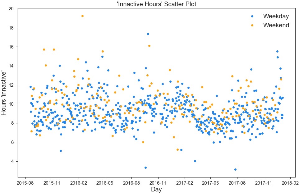
This is fairly interesting, but there’s not much concrete insight that can be gained from this. However, it’s clear there are some patterns hidden in here, so I decided it’s definitely worth digging a little deeper.
Digging Deeper
There’s a lot of data to analyse here - so my next step was to just look at my 2017 data. Also, instead of just focusing on my inactive hours during the night, I wanted to look at every single recorded activity.
I’d seen this high scoring post of daily activity on r/dataisbeautiful and wanted to use this as inspiration to create my own version in Python, with my own data.
Since the data doesn’t take into account daylight saving I needed to make the dateime value ‘aware’ of the timezone in which it was recorded, thus all data should be consistent throughout the year:
tz = timezone("Europe/London")
UTC = pytz.utc

df2['start'] = df2['start'].apply(lambda x : x.tz_localize(UTC).tz_convert(tz))
df2['end'] = df2['end'].apply(lambda x : x.tz_localize(UTC).tz_convert(tz))
Also, I needed to calculate the time difference between the activity ‘start’ and ‘end’ time for all values and convert this value to a float in order to plot:
df2['act'] = df2.end - df2.start

df2['hours'] = df2['act'] / np.timedelta64(3600, 's')
So, just a quick note, before explaining the results. I consider this to be fairly sensitive information about myself, so I have not included detailed axis values on the plots. At least you can get a good idea of what is capable from the data though.
Each small horizontal blue line (for weekdays, and orange for weekends) represents ‘activity’ for a given period of time. The longer the line, the longer the period of activity. One day (24 hours) is represented by the distance from the far left of the plot to the corresponding side on the far right.
2017 Timeline Plot
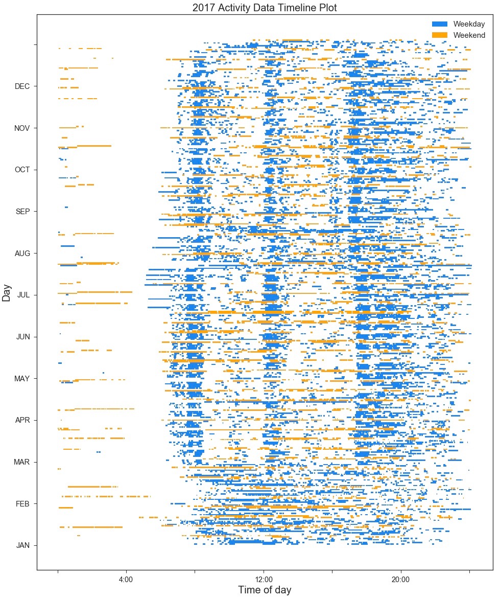
Most people have a daily routine that revolves around work and the same can be seen in my case. The top three quarters of the plot, from March onwards, shows the period of time where I started my current position as a data engineer. There are three clear bands which represent me commuting to work, walking during my lunch break and then commuting back from work. The only clear breaks from this routine can be seen at the end of July and in mid-August when I had some holidays.
The bottom section (before March) represents my time after returning to the UK and starting a job with not much to speak of in the way of a routine. The job was fairly active though, which is evident with the longer smearings of blue.
In general, weekends show a lot more sporadic activity, with no clear activity bands. Also, they contain much longer lines which can most likely be attributed to bike rides or long walks.
Something More Quantitative
So far, a lot of the analysis and insight from the data has been fairly qualitative. As the weekend was drawing to a close, for my final bit of insight, I wanted to look into the numbers.
For this, I moved back to the ‘sleep’ hours per day data - which I used in the initial plot. Previously, I plotted every single day, distinguishing only between weekdays and weekends. Here I wanted to find out how different days of week affected the amount of sleep I had.
Using the associated date, I assigned a number to each day of the week:
sleep['day'] = sleep['date'].dt.dayofweek
From which, I was able to ‘group-by’ this value over the entire time range - obtaining statistics such as the mean, min, max and standard deviation of ‘sleep time’.
| Day of Week | Mean Sleep Time (hrs) | Standard Deviation | 25 Percentile Mean (hrs) | 75 Percentile Mean (hrs) |
|---|---|---|---|---|
| Monday | 9.35 | 1.56 | 8.23 | 10.09 |
| Tuesday | 8.85 | 1.67 | 7.81 | 9.54 |
| Wednesday | 8.92 | 1.46 | 7.99 | 9.69 |
| Thursday | 9.19 | 1.44 | 8.29 | 9.98 |
| Friday | 9.45 | 1.99 | 8.16 | 10.76 |
| Saturday | 9.75 | 2.21 | 8.22 | 10.69 |
| Sunday | 9.92 | 1.77 | 8.70 | 10.93 |
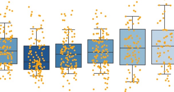
For the final plot I used the Seaborn library. Personally, I find Seaborn more straightforward to use than Matplotlib and the end result looks a lot more visually appealing too…
Statistical view of ‘Inactive hours’ (all data)
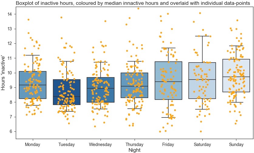
I won’t go into too much detail with the analysis, but what’s initially evident from this is there are some very clear differences between day (or night) of the week and number of ‘inactive’ hours. Surprisingly, I have (roughly) an hour less sleep on Tuesday nights compared to Friday nights when comparing median values. Friday also has the largest spread of the interquartile range, suggesting less ‘routine’ sleeping patterns. From this I can consciously try to improve my sleep patterns, such as trying to even out the sleep I get on weekdays.
Wrap-up
So there we have it. Personally, I found this mini project really interesting. Specifically because I was investigating personal data that I have unwittingly collected about myself for the last ~2.5 years. I’m well aware there’s a lot more I could do with this. For now though, that will have to wait for another rainy weekend!
If you found this interesting, all my code can be found in this github repo. Simply clone the directory, add your activity CSV data into the data folder (having converted from XML), and run the jupyter notebook (with python 3, and any other dependencies stated in the notebook).
Let me know how you get on and I welcome any advice/improvements!
Links
https://github.com/jcalcutt/projects/iphone_activity_data
Written on January 8th, 2018 by Jordan Calcutt